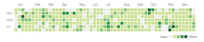
A calendar heatmap is a type of chart that presents a metric calculated based on the number of events that occurred on a specific day. Each cell represents one day of the year:
- The more intense the green color, the more activity occurred.
- The less intense the green color, the less activity occurred
- Gray: no activity occurred
It is used in Dashboards. With it, you can quickly analyze whether any activities took place in a project.